WY•RD is a misophonia awareness campaign that was designed with the hopes of getting the disorder onto the DSM-5. The DSM-5 is the official government guide to all clinically recognized mental disorders and conditions. Misophonia was discovered by Pawell and Margarett Jasterboff back in 2001 while they were studying patients with Tinnitus. During their research, they noticed unusual brain activity in certain subjects when they were exposed to certain sounds. These sounds vary from person to person, but they tend to be sounds that are repetitive in nature. Due to this discovery being relatively new there is little research done about the disorder, which leads researchers to not have a full understanding of the disorder. In return, having this lack of understanding becomes a hindrance to gaining the recognition the disorder deserves.
Building the Brand
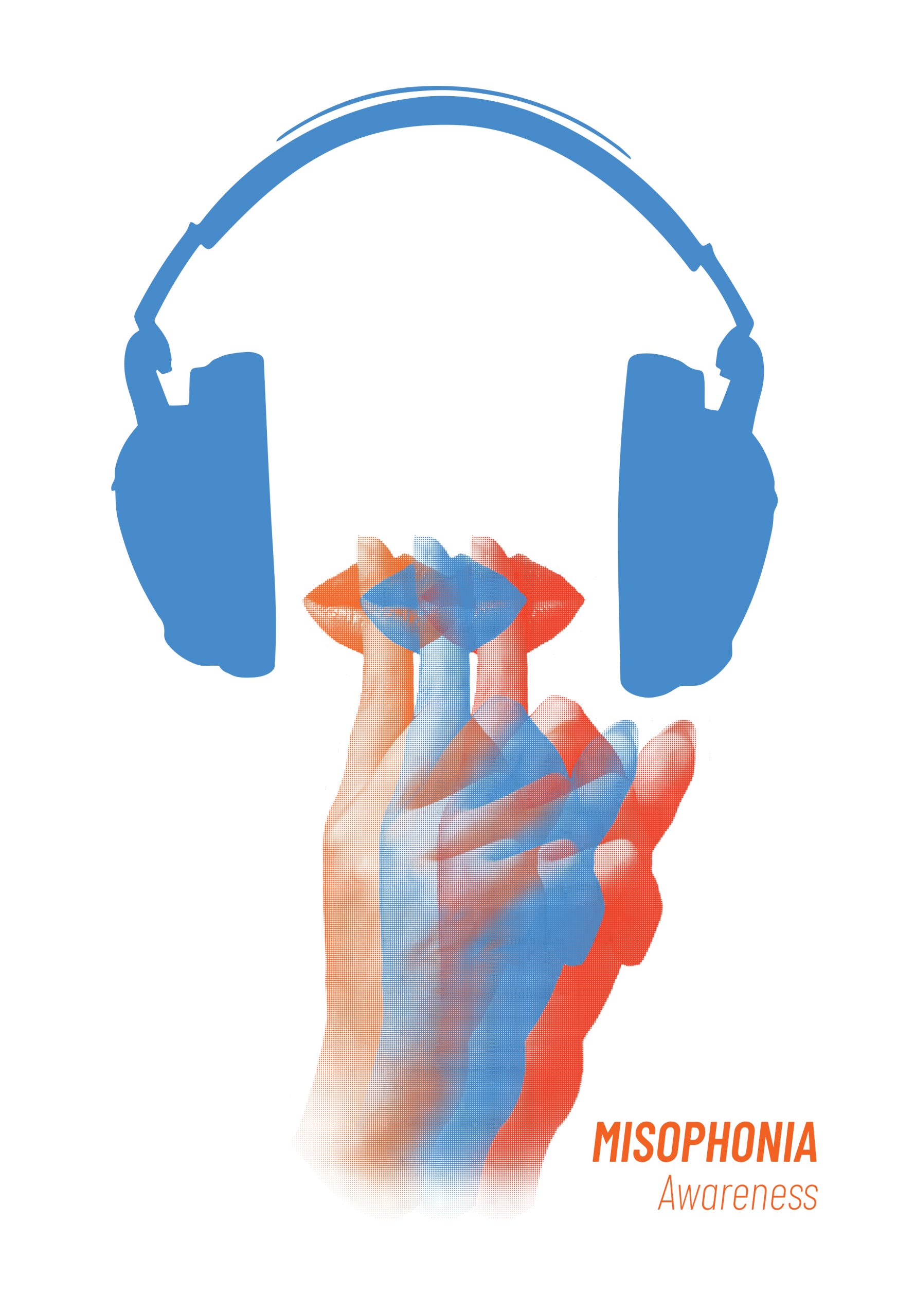
Logo
The name of the campaign is called WY•RD. Those who have misophonia are often told that their brains are wired differently. This is because of the way their brain process particular sounds different from the average brain, resulting in triggering the fight or flight response to those sounds. But the name WY•RD has another meaning. When a person says they feel wired, it means that they feel very tense and agitated. The halftone patterned that is used on the logo and throughout the campaign points towards the placement that misophonia has within the science community. Misophonia is new to the community with only having bit and pieces of what is is it and why things happen. For now, there is enough data and research collected to get a general picture of what misophonia is, but the whole picture is still left uncovered.
Typeface
Barlow is a condensed typeface that helps to communicate the sense of feeling trapped and closed off. This san serif was selected for this campaign in order to give the brand the voice of a misophonic, while educating others on what misophonia is without being intimidated.

Color Scheme

Misophonia Blue
This is the official awareness color for misophonia. Therefore, it was important to implement blue in the campaign. That way,
it would help to aid the momentum for awareness to
all misophonia campaigns.

Firey Red
Red was selected to be used in the campaign to help communicate anger. This emotion is the predominant emotion a misophonic feels when exposed to their trigger noise.

Hopeful Orange
The use of orange was chosen
to help communicate with misophonics themselves.
The campaign wasn’t just
meant to bring awareness to misophonia. It was also created to help give optimism to those who already have it or thought they were alone.
Misophonia Briefing
This awareness campaign was designed to span across two walls. The first wall was to provide information to the viewer. This would help give them a basic understanding of what misophonia is. This wall would include a large scale banner that would include a personal story, the laser cut logo, brochures, and stickers. The second wall would be the experiential portion. I wanted to include this wall because it would help allow the viewer to put themselves in the shoes of a misophonic, even just for a moment. This wall would include a video, screen printed posters, headphones, and an information poster.

Setting the Mood
In order to get the view to start thinking as someone who has misophonia rather than seeing the campaign about others who have it, a personal story was placed at the beginning of the campaign. This story houses a personal story from the artist from the perspective of the viewer. By doing this, it was hoped that this would help aid the audience to feel empathy as they encountered the rest of the installation.
Take-Aways
Stickers
In order to get the awareness outside of the gallery setting this campaign was placed into, these stickers were created. These stickers have to potential to travel far and being able to be seen anywhere. The design of the sticker itself includes a pair of headphones. This is important because those who have misophonia are an important part of the day to day life. The hushed gesture of the figure in the headphones communicates the need for silence a misophonic has.
Brochure
The contents of the booklet aimed to help educate those who would like to learn more about misophonia. The page order of the booklet was designed in the order of how people would naturally ask questions when curious about the disorder.


If you would like to view the full brochure click here.
Stepping into the shoes of a misophonic
After being introduced to what misophonia is the audience would then move onto the second wall of the campaign. This wall was to provide no only an experience for the viewer but also to create an environment that they would be stepping into. As the audience stands beneath the headphones to watch the video provided, they are surrounded by the repetitive objects of common triggers. While one person may be stepping into the shoes of a misophonia, those around them will see an individual wearing headphones while being surrounded by these visually obstructing images.
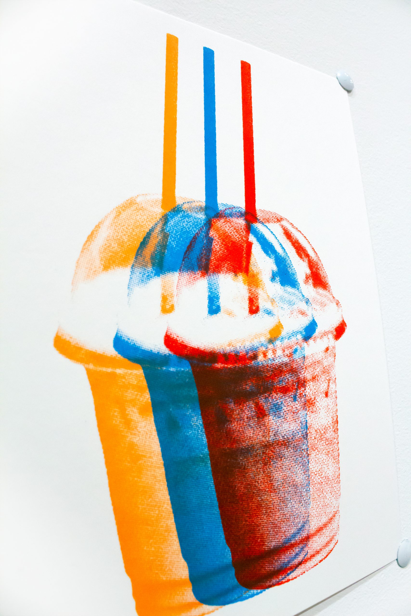
Prints
Each of the 6×8 prints houses a known misophonia a person may be triggered by. The offsetting of the images aimed to visually disrupt the viewer with overstimulation. Repetition is an important element to understanding misophonia, for the sounds that become triggers tend to be repetitive in nature.


Video
In order to allow the audience to fully understand what it’s like to be triggered a video was created. This video has 5 common everyday noises a misophonic may be triggered by. The first 15 seconds of each clip is played normally while the last 15 seconds the audio is then replaced with the top 5 most annoying sounds as found in a study by New Castle University. Ultimately the video is stating, this is what you see and hear vs what a misophonic will see and hear. The purpose of this video not only to provoke emotion within the viewer but to also change their perspective on the noises around them.
Process
To view the full process notebook click here.