Speax is a women’s underwear company that designs stylish and comfortable underwear to help women who experience incontinence. These bladder leak protective underwear are washable and more cost-effective. Speax aims to bring back the confidence to women who might otherwise feel self-conscious. These underwear are offered in multiple styles with a selection of a few beautiful, yet mature colors for each. The inspiration for this package redesign was to bring back the sense of luxury that may have been lost.
From Basic…
The original packaging was very minimal. Not just in the design, but also in the amount of packaging. The underwear itself was folded neatly into a square with a belly band wrapped around it. The band itself housed the details of what style, color, and size the underwear are. Then in the smaller text, they mention how much liquid it can hold. While this gave the design the information it needed to communicate the important details it lacked visual interest.
Packaged with the underwear is a card. On this card they present the perks of the product on the back, and a marketing image with models and their logo on the front. The card works for this design because of the lack of packaging. Both the card and underwear are placed into a plastic sleeve that seals with sticky glue. The overall experience of the product feels cheap and generic. The price point for a single pair of Speax underwear range from 25-39 dollars for a single pair. For most women, this seems like a lot for a single pair of underwear. Because of this, the packaging would be more effective if it had a more luxurious feel. These women are paying extra for a nice pair of underwear. Why wouldn’t you want to package them nicely?


… To Luxurious
The new design will place the underwear into a nicely packaged box. This box will open untraditionally with a sliding drawer. This drawer will help to create a more luxurious experience and giving a sense of quality. Something the previous packaging lacked. The box would house the same information that was presented on the card and belly band from the previous design. Instead, there is a far more effective use of scale, hierarchy, and color. The transparent teardrop shapes allow the customer to see what the product looks like in the box without having to open it. This would help to preserve the quality of the produce.
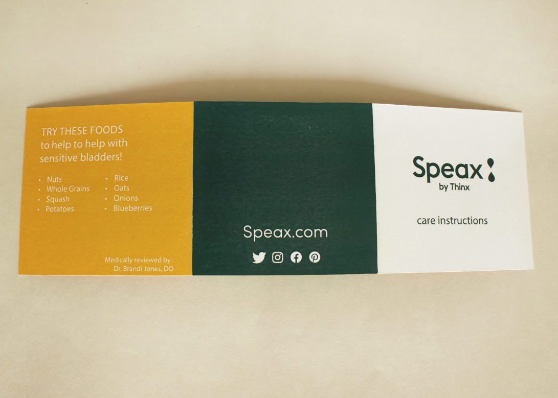
There was one thing added to this packaging design, and that was the inclusion of the care booklet. On the card of the
previous packaging, it states it was easy to care for but didn’t explain how to care for it. With the product being something
that costs more than the average pair of underwear people may find it important to know how to care for them.
The care instruction could easily be found on the Speax website, but by including the care booklet with the underwear
it becomes more convenient for the consumer.


*The logo, colors, typefaces, icons, and design elements are property of Thinx.Inc © 2019. The items used are for educational purposes only with no intent to sell.